Delivering a Seamless UX Localization Across Teams and Cultures
Driving cross-functional UX delivery for a FinTech gaming app that achieved 78% retention growth.
Product & Project Management
Design & Prototyping
Tech
Design Thinking
Localization
User Ressearch & Analysis
Cultural Design
Visual Branding
Customer Experience

Role: Visual Designer · UX Researcher · Localization Lead
Duration: 6 months
Tools: Figma · Adobe Creative Suite · Canva · Miro · Google Forms · Trello · Slack
Company: CiaoLINK FinTech
Overview
CiaoLINK is a Vietnam-based FinTech company building diverse digital products including mobile gaming, café ordering, and EdTech platforms.
When I joined the team, CiaoLINK had launched several popular gaming apps such as Shan Koe Mee ShweYang, Shan Koe Mee BooGyi, Poker, and Slot.
While these apps performed well in Vietnamese and English markets, they felt disconnected from local audiences as the company expanded into Myanmar.
I led the localization and visual adaptation of the gaming app for Burmese users, reimagining its look, tone, and experience to align with Myanmar’s cultural preferences. My focus was on translation accuracy, visual adaptation, and culturally inspired interface updates that made users feel welcomed and understood.
The Challenge
The original Vietnamese app was functional and visually strong, but it failed to engage Burmese users because of fundamental cultural and technical barriers.
Key Problems Identified:
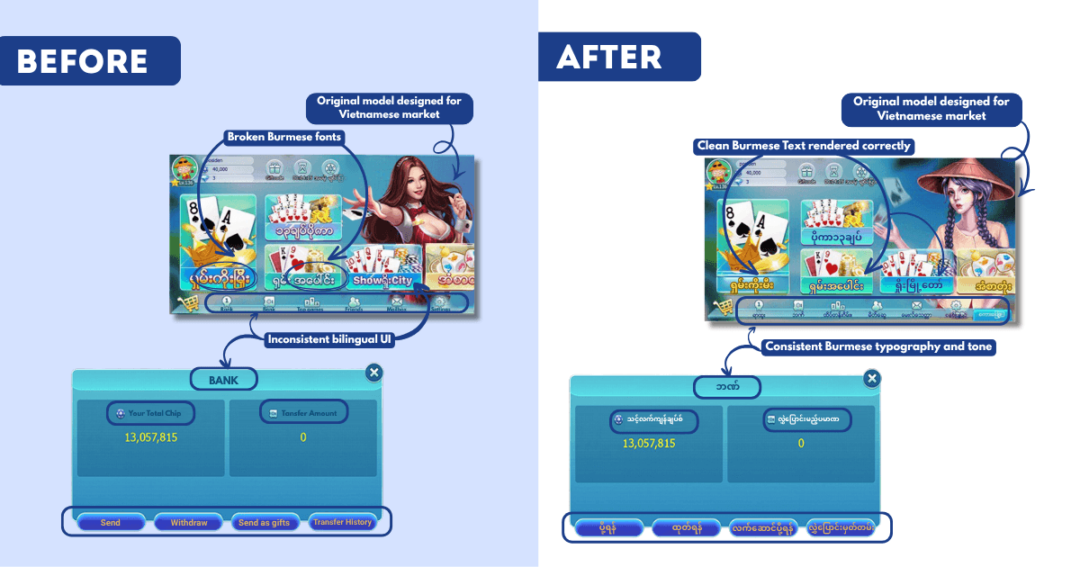
The font system was incompatible with Burmese script, causing broken or overlapping text and unreadable menus.
Direct Google translations made the content awkward and unnatural, reducing user trust.
The color palette and tone felt foreign, too bold and competitive for Myanmar’s softer, more harmonious design preferences.
Small text and dense layouts caused navigation issues, especially on low-end Android devices.
The overall visual and emotional tone lacked warmth, familiarity, and celebration.
To succeed, we needed more than simple translation. We needed a cultural redesign that felt joyful, trustworthy, and visually rooted in Burmese identity.
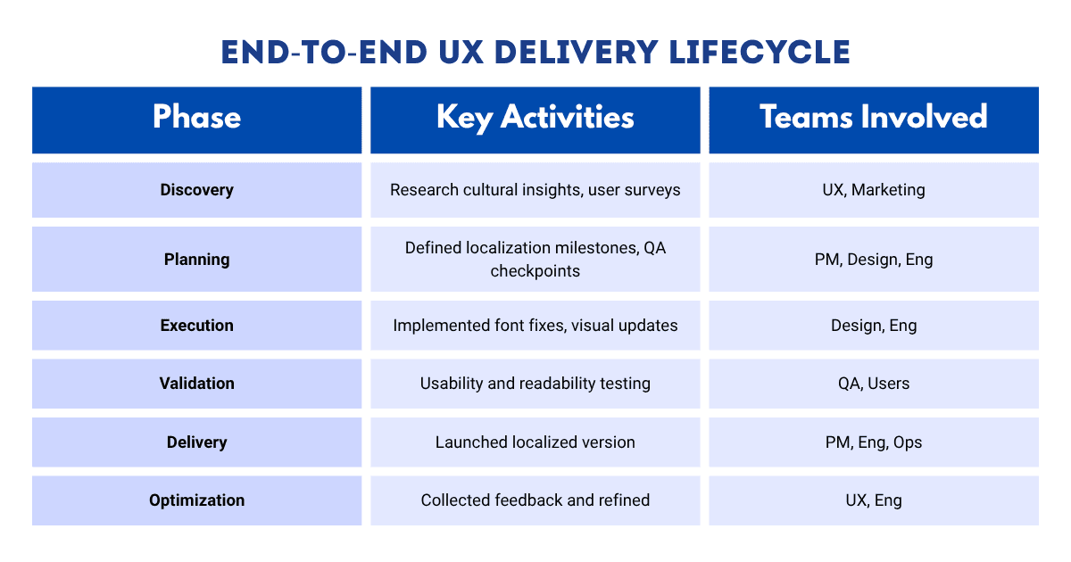
The Approach
I approached this project as both a Product Designer and Cultural Bridge, working closely with teams in Vietnam and Myanmar to ensure the design reflected the local audience’s values and visual taste.
My key responsibilities included:
Conducting user and cultural research to understand Burmese preferences.
Localizing the interface, typography, and color system for accurate visual rendering.
Rewriting text in collaboration with native speakers to ensure tone and clarity.
Designing marketing and in-app campaign visuals aligned with Burmese festivals and user culture.
Testing usability, language readability, and visual comfort across multiple devices.
Research & Insights
To create something that resonated with Burmese players, I needed to understand what joy, trust, and beauty looked like in local design culture.
Through 100+ user surveys and interviews, I uncovered clear insights:
Users associate blue and purple tones with calmness, trust, and comfort.
Gold accents evoke festivity and prestige when balanced with softer tones.
Burmese players prefer simple, joyful, and easy-to-read designs over highly stylized or cluttered ones.
Accurate Burmese text builds credibility; even one awkward translation can hurt retention.
Cultural celebration visuals such as soft light effects or symbolic shapes increase emotional engagement.
These findings guided my visual and interaction decisions.
Design Execution
Instead of redesigning the app from scratch, I localized the existing design system, ensuring that each element from text to visuals resonated with Burmese players.
Typography & Language
The original font system couldn’t render Burmese correctly, leading to broken characters and awkward spacing.
I replaced it with Noto Sans Myanmar, a Unicode-compliant typeface optimized for small screens and cross-platform readability.
I also collaborated with native speakers to rewrite translations, replacing robotic Google-translated lines with natural Burmese phrasing that sounded human and conversational.
Visual Design Adaptation
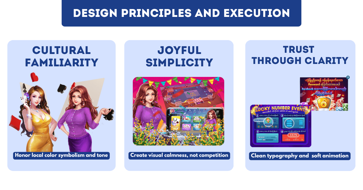
I refreshed the color system using blue, purple, and gold, a combination that represented trust, wisdom, and festivity, aligning with Burmese cultural cues.
Blue provided a sense of calm and reliability.
Purple added elegance and local aesthetic harmony.
Gold symbolized success and joy.
I applied these hues across backgrounds, buttons, and highlights to create a unified look that felt both modern and culturally expressive.
I also simplified icons, introduced soft glow effects, and integrated subtle golden animations for win moments, enhancing emotional delight.
Cultural Content & Campaign Design
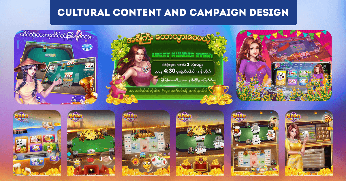
I designed localized banners and event visuals for app-store listings and in-game promotions.
Themes reflected Myanmar’s cultural celebrations, such as the Thingyan Water Festival, using soft gradients, festive patterns, and gold-accented typography.
These visuals helped connect the product to everyday joy and social celebration beyond gameplay itself.
Testing & Collaboration
I collaborated with QA testers and users in Myanmar to validate visual consistency and readability.
We conducted 15 usability sessions across different Android devices, focusing on text clarity, emotional tone, and ease of navigation.
Feedback highlights:
“Feels elegant and local, not like a foreign app.”
“Colors are calm and friendly, easy to look at for a long time.”
Their insights guided minor refinements to text spacing, button contrast, and event banner color balance.
I also maintained continuous communication with developers to ensure accurate rendering of Burmese fonts and assets.
The Outcome
The localized Burmese version launched successfully and exceeded user engagement goals.
Metric | Before | After Localization |
|---|---|---|
App Store Rating | 3.9 | 4.3 |
Retention (Week 1) | 55% | 78% |
User Growth (3 months) | — | +30% Burmese users |
Average Session Time | 2.1 min | 3.4 min |
Font Issues | Frequent | Resolved 100% |
Impact:
Improved accessibility and readability strengthened user trust.
Updated color and tone created a calm yet festive atmosphere.
Localized campaigns boosted user excitement and connection to the brand.
The localization framework was later applied to CiaoLINK’s Thailand and Cambodia markets.
Reflection
This project taught me that localization is emotional design at scale.
I learned how to translate not just language, but culture, turning fonts, colors, and words into a visual language users emotionally understand.
It also deepened my skills in collaborative design operations, bridging cultural insight with technical execution.
The moment Burmese players said “It feels like our app” was proof that thoughtful localization can transform a global product into a local experience.
“Good design listens before it speaks. This project reminded me to design with empathy first.”